Wednesday, 15 December 2010
3 Draft Posters
Poster 1:
In this poster I was trying to achieve a scary atmosphere that includes the bricks at the backgrounds but also a shadow against the wall from the main character. I have only showed half of the main character so it emphasizes the shadow. I wanted to show the main character of the film because main film stars make's films so then people are more encouraged to see it. The actor is holding a gun to his hand so this shows that it is a action thriller film, which includes voilence and death. The title of this film has a red font that looks like blood that drips to show that it includes blood which makes the genre of the film thriller.
Poster 2:
This poster is a teaser poster to introduce the main character in the film, this is showing the victim showing emotion when he is getting shot, I have included blood at the side of his head to show that there is a shooting and that this shows the genre in the film. The film title is in a graffiti type font to show the atmosphere of there it is set.
Poster 3:
In this poster I have included a release date this is to show when the film is out for the audience to go see it. I have not included any characters in this poster but have included the objects that are being used in this film, I have included guns and drugs to show what the film is about from a audience view it is a negative film especially as the objects are in a pool of blood. The film title I have left it as a simple black font because I wanted the blood to stand out and be the main focus when the audience see's it.
Monday, 13 December 2010
Harry Brown
People
In this film poster of Harry Brown, it shows the main character “Harry Brown” played by Michael Caine is on the right hand side of the poster quite large, he has carrying a big bag and gun this is to show that the film is violent. On the left hand side there is a gang holding guns aswell and the main gang leader in the front. This is showing that Harry Brown has been involved with a gang and that they are looking for trouble.
Design
The design of this film is giving out a grim feeling because of the weapons involved that will show that it is a violent film. The colour of the actors are in black and white this is showing boldness and a dark mood. There is a target in the middle of the poster to show that there might be a sort of assassination in the film.
Colour
There is only colour on the target to make the title stand out and that they have a used a blue and red which are primary colours and they stand out against the white. The characters are all black and white to show that is it a grim film and quite dark. They also still stand out when they are against a plain white colour background.
Title
The title is easy to read, it is in a white colour and in a simple font, this is against the target and is slightly slanted like you were looking at the target slanted.
Other Information
Above the main title it says the main character's name that played Harry Brown “Michael Caine” this is showing that the film is mainly about him and that whoever enjoys his films.
There is a tag line at the bottom of the first word of the main title “One man will take a stand” This shows adrenaline in the film and that there is violence and death in the film.
At the bottom the poster is shows the realised date of the film in bold and clear to read so that the audience will know when to see the film.
Friday, 10 December 2010
Adulthood
People
In this poster of "Adulthood" there are the 8 main actors in the film, they are in different certain positions to show fear as you can tell by there facial expressions. You can tell that they are associated with gangs, as they are wearing hoodie's and trackies and they way that they are standing shows that they are together in a gang, you can see the main character is standing up near the front to show he may be the leader of the gang and that the rest are sitting on the floor that are in the front to show they are part of the gang. They are placed together as in one big group, to show what the film is about gangs. At the bottom of the poster there is a baseball bat, this shows that there is violence in this film as it is on the floor in front of the gang.
Design
The design to this film has a grim feeling to it as it is trying to evoke fear as there are weapons on the floor to show violence and that the way the people are put close together to show more fear in the design as they are together in a group as one gang.
Colour
The colour scheme on this film poster is dark warm colours, the sky is a warm orange colour to show sunset, the buildings in the background are silhouetted in a black colour to show boldness. The clothing colour that the actors are wearing are quite dark black and grey colours whereas the girls that are in the film are wearing quite bright colours this is to show what sort of clothing that they wear.
Title
The title of the film is in a simple font where it is easy to read and and it is center aligned at the bottom of the poster. It is the first thing you will read as it is quite large and bright with the white against the ground dark colour.
Other Information
There is a tag line on top of the main title "After kidulthood comes..." this is good for the audience and it is a second film from when people enjoyed watching kidulthood. At the bottom of the main title it says "A Noel Clarke film" this is telling the audience who directed the film, as the audience may enjoy the other films that the directer has directed.
Snatch
People
In this poster Snatch it has the main characters in the film, if people have a favourite actor/acctress that they like they would want to see a film with there favourite actor/actress. If the actor/actress is a big film star, people would be more likely to see the big film stars. Brad Pitt is there because he is the biggest major star and is larger than the other actors, the other actors are only just introduced. You get the two main characters (Turkish and Tommy) in the middle so it shows like a tunnel into the characters when you look at the characters standing in a certain way to show what the film is about, they are wearing big long coats with gold jewlerry and crosses.
Design
The design to this film shows a comedy mood to it, where there are the different gangs and there will be a leader that will lead the gang, the way the actors are standing would show a comedy side to it, for example Tommy is putting a gun to his trousers and the way he it is doing it sneakly so that Turkish wouldn't see.
Colour
The colour scheme of the poster is just a warm red colour, all the characters are in just one colour, these colours have been chosen to symbolise blood and violence in the movie when there are gangs there will be violence.
Title
The title of this film is "Snatch" in the film poster is it easy to read as it is quite bold with a simple font. They have used the colour white so it would stand out against the warm red colour of the actors. Snatch is a simple and direct one worded title, it is in the centre where the characters all sit above the title.
Other Information
There is a tag line "stealin' stones and breakin' bones" underneath the main title, it is in the same font as the title, which then makes the audienece read the tag line after they have read the title.
On the top of the poster it tells you the main characters in the film, this will actract the audience if they have a certain actor that they like to see.
In a small font on top of the title it says "A Guy Ritchie Film" this shows who directed the film, so that audience may want to see it as they enjoy Guy Ritchie's work.
Tuesday, 7 December 2010
Story Board
In the opening scene you have an extreme close up of a gun pointing at a man and then it would go to a close up and that will show the victims fear. They victim then gets shot and we have used a point of view shot to show the killers reaction when he is shooting the victim.
After the shot it will show the victim on the floor laying down with his bag next to him. The killer will then see the bag and starts to pour the objects on the floor. There will be a close up of the objects all together on the floor.
On the second page of the story boards the killer panics and starts to put the objects back into the bag he will then look around and picks up the victim and tries to look around where to put him he then finds the nearest large bin and he puts the victim into the bin. There is then a establishing shot where the kills is then walking away. The victim gets to his house and walks into through the door. He is then in his room and he takes the stuff out of his own bag and he puts the victims bag into his bag.
On the third page of the story board it starts with a establishing shot where he then walks out of his house and then goes onto the public bus. Then there is a close up of his face where he is on the bus and on the phone. He then gets off the bus and goes into a alleyway where he is meant to meet someone. There is then a close up of them both giving the bag to the man and trading money.
Wednesday, 1 December 2010
Action-Thriller Moodboard
I was set a task to create a moodboard in Photoshop to give us idea's about the short film that I am going to create.
I have included the main aspects that will be in a Action Thriller film for example, guns, blood, drugs and gangs.
I have gotten picture's from google images and some from flickr. I got taught about the creative commons which is about the copyright policy when we are using other people's images.
Tuesday, 16 November 2010
Sabotage
Wednesday, 10 November 2010
Garage Band
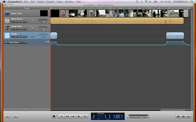
We used the program Garage band, I tried to achieve a dance beat track, I had used a hiphop beat with a RnB beat as the background sound but then used the dance bass synth with the dance pad, I used the tambourine so join with the background sound, but I had cut the tambourine and left a hole but then joined it back in again after, I then left a fade towards the end by changing the sound of the volume of the synths.
We uploaded the MP3 on divshare, to get a MP3 track, exported my work to disk and I ticked the compress box using MP3 encoder and changed the audio setting to higher quality.
Tuesday, 9 November 2010
Special Effects Glossary - Squibs
Special Effects Glossary - Pyrotechnics
Pyrotechnics
Pyrotechnics, are using the science of materials using chemical reactions with either heat, light, gas, smoke and/or sound. They use safety matches, oxygen candles, explosive bolts and fasteners, and components of the automotive airbag.
Special Effects Glossary - Prosthetics
Prosthetics
Prosthetics is adding more onto a human, for example prosthetics makeup the process is sculpting, molding and different casting techniques to create advance cosmetic effects. It starts with the taking a mold of a body part, to use as a base and using skin-safe silicone rubber, you mold the different things you want to add.
Special Effects Glossary - CGI
CGI
CGI: Computer-generated imagery, is 3D computer graphics, these are normally used to make cartoons. It is more of physically based process, which means you wouldn't need actors, props or expensive film sets. This combines of 3D model objects and programmed movement. The models are constructed out of geometrical vertices, faces, and edges.
Special Effects Glossary - Bullet Time
Bullet Time
Bullet time is a special and visual effect, which changes the speed, for example slow motion, In a certain angle so it would show the slow motion, for example flying bullets, this is shown in the matrix, and it shows that the bullets are slowing down when they are being shot at the person.
Special Effects Glossary - Blue/ Green Screen
Blue/Green Screen
Blue and green screen is a technique for using two images when the one with the blue/green screen is made transparent and changed during the editing process, and put onto another screen which then merges the two images together. They use this when they are doing the weather forecast, as they use either a blue or green screen so then it would go onto the other image, for example if you use a blue screen and the person is wearing blue clothes it would replace the it and it would think it was the background.
Special Effects Glossary - Animatronics
Animatronics
Animatronics is using electronics and robotics to stimulate life. They are used in movie making using CGI and stop motion. It is more of physical objects moving in real time in front of the camera. They use this to make creatures that do not exist, that the action that is being made done is to risky to use real people or animals, or this may cost more. The actuation of specific movements can be obtained with electric motors, pneumatic cylinders, hydraulic cylinders and cable driven mechanisms.
Monday, 8 November 2010
Bomb Sequence
Section 1: The Task & Planning
We had got given a task to make a bomb sequence of longroad being blown up. We had drawn up a storyboard, which would show each shot in order. We then had wrote a shot list, which means the order of the shots that we are going to shoot at, we need to film the shots in a different order because then we are in two different locations and it would take less time if we filmed it all in one location and then do all the other shots in the second location.
Section 2: Filming & Editing
We didn't film the the shots in order as it would be better if we filmed the shots in one location and then the rest of the shots in the other location. My individual contribution to the production of the bomb sequence was performing and directing. We had forgot to use the clapperboards and we got confused what shot number it was, so the clapperboards really help during the editing process as it would show us the order our shots should be.
We used green screen to make it look like that long road is on fire, and an explosion the way we did this was that we got given a various choice of different explosions, so we then put the explosion that we want and then change the video filter and to the either the blue/green screen or colour key, we then change the colour, tolerance and edge thin, so then you can't see the background colour of the fire.
Tuesday, 2 November 2010
Monday, 1 November 2010
The Meeting Task
Section 1: The Task & Planning
Our task for the Meeting was to shoot a meeting sequence which shows the bomb getting handed over from character 1 to character 2, we then made our own dialogue which would fit well with the sequence. I had my own storyboard which I then drew the different shots out with the dialogue underneath. We had given a shot list which went in the shooting order of (1,2,3,12,4,6,8,11,5,7,10,9).
Section 2: Filming & Editing
We had shot the shots in a certain order so they weren't in a narrative sequence because we wouldn't have to move around the room so it would save time.
My main contribution to the productions of the meeting sequence was directing and filming.
The clapperboards have helped during the editing process as when we had to put the shots in order we could see straight away what shot it was, so it was easier to put in order so we wouldn't have to watch every shot over.
I have learnt the 180 degree rule whilst shooting the meeting task, to not go through a certain line so the audience doesn't get confused when the location or background has flipped over.
In shot 3 I don't have character 2 sitting completely down on the chair, as there was some laughing during the shot so I had cut it out so it would be more professional and flow more with the other shots.
Wednesday, 20 October 2010
180 Degree Rule
Match On Action
Tuesday, 19 October 2010
The Phone Call Task
Section 1: The Task & Planning
The task of the phonecall task was to plan a phonecall sequence to use the method of how to do a phonecall sequence without doing all the locations at different times. We then had to use the storyboard to draw out the different shots and then to add a dialogue to go with out shots. The shot lists that we got given went in a certain order.
Section 2: Filming & Editing
The reason why the filming process was not in the order of (1,2,3 etc.. ) was because when you are at one location it is more time consuming when you are filming all the shots in that location. We then used the editing software Final Cut to then put the shots in the right order.
My contribution of the production of the phone call sequence was directing and filming.
When i had filmed all the shots I had started to edit the sequence on Final Cut, we had used the clapperboards in the beginning of filming this helped during the editing process as we could put all the shots in the right order and then we could cut the clapperboards out when we had put them in the right order.
Rough-cut is when you put the shot onto final cut without editing it and you just put the shot in the right place.
Cutting on movement is when you cut when the movement of something is just about to start. This gives motion into to the shot.
I have learnt how to film in two different locations and then to edit them together so it would fit well and how to cut the shots a bit shorter so that it would flow more.
Sunday, 17 October 2010
Horror Workshop
James Ward from the National Film School Of Ireland, graduated for model making and production design for film and television.
First James put a bald cap on someone so when he was molding his face the mixture wouldn't stick to his hair so he used contact glue around the end of the bold cap so it would stick to his head. James then put on polyvinyl gloves so the silicone wouldn't stick onto his hands. He had two types of silicone that he then measured a cup and a half to a mixing bowl and then he used his hands to mix up the two silicone's together.
Once the mixture was mixed together he used two plastic tubes up his nostrils so he could breathe once the silicone was on his face, James made sure there wasn't any air bubbles otherwise when you put the plasticine into the mould it would go through the other side.
James then waited for the silicone to set this takes about 15 minutes, he then gets plaster and dips the fabric into water and then places the fabric onto the face in a criss cross pattern so it stays on stronger he does this until the mask is about half a inch tall.
Once everything has set he told the person who he's moulding his face to then puff his cheeks to take the mask off his face, as there is holes from where his nose was James used a clay to block up the holes of the nose so when he pours the plaster into the mould it wouldn't go through.
James then had to make the plaster so he added the water into a mixing bowl and then added the plaster by getting a plastic cup and then using his hand to siv the powder through into the bowl he then started to used his hand to mix the mixture at first it was a milk like mixture but when you kept mixing it, it turned in a ice cream form.
He then poured the plaster into the mould of the face.
Tuesday, 12 October 2010
Target Audience
My target audience spends most of her time shopping in her favourite shops for example, H&M, Topshop, Zara, River Island, Urban Outfitters. After she has been shopping with her friends she tends to go to Starbucks had has a catch up with her friends with a double chocolate cookie and a caramel frappicino. Her favourite magazine that she gets weekly is the fashion magazine "LOOK". She goes on facebook and twitter to catch up with the latest gossip. She does ballet 3 times a week and enjoys dancing. Every friday her and her friends have a meal at Nando's her favourite restaurant and they would go out clubbing after a couple of drinks at a bar. On a sunday she would stay at home and would play the wii sports and just dance where she would relax and read her Look magazine. Her favourite films are Step Up and Hairspray and The Devil Wears Prada, as she likes fashion and dancing. Her favourite chocolate is galaxy cookie crumble and her favourite packet of crisps is kettles crisps.
Thursday, 7 October 2010
Find Your Tribe
Find Your Tribe - created by channel 4 by research agencies crowd DNA and voodoo. This site invites you to complete an interactive quiz which asks you questions about your tastes on music, fashion, lifestyle, brands and media preferences.
Blinger
These Are Our Class Results :
Clubbers 1
Townies 2
Rahs 1
Chavs 1
Blingers 1
Sport Junkies 1
DIYers 1
Indie Kids 1
Skaters 1
Scene Kids 1
Monday, 27 September 2010
Logo
Untitled from cmdiploma on Vimeo.
1. What was the most difficult thing working in photoshop?
- The most difficult thing working in photoshop was getting used to getting all the shapes on a different layer. The way I resolved it was to when i moved the shapes I would remember to put the shape that I want to move on a different layer.
2. What was the most difficult thing about working in final cut?
- The most difficult thing about working in final cut was making sure the wipe effect would go the right direction. The way I resolved this was I had asked Dave and he taught me how to do the wipe effect in different directions and that I had to do a key frame to the start and finish.
3. What was you most pleased about and why?
- I am most pleased with the sound effect because it goes really well with the logo and in the right pace of the wipe effect.
Wednesday, 22 September 2010
Audio/Visual Media Product
The Last Exorcism
The Last Exorcism is a horror movie directed by Daniel Stamm, its purpose for this movie is to entertain people. It's target audience is for people older than 15 as that is its certificate and its for people that enjoy horror films.
Visual Media Product
Advertising Media Product
Electronic Media Product
Print Media Product
Audio Media Product
Subscribe to:
Posts (Atom)