Tuesday 3 May 2011

Moviestorm Session 23+24

In session 23 + 24 the class had all finished there moviestorm short film so we had a class viewing where we go round to each table and watch different films and we got given a grid where we had to fill in what our group had thought about other groups film. Our group for very positive feedback from the class. The strengths we got from the class was that we had a simple and easy to follow narrative and then the music and the sound effects fitted well to the film and that they were in the right timing. Another positive feedback that our group received was the sound effect that was there when the zombie’s came out of there grave. Another feedback that we got that the class enjoyed was the end credits where there was a dancing skeleton at the side whilst the credits were scrolling up.
There was some area’s that we needed to improve on was that the camera shots that we made were too simple and it needed a more variety of camera shots. Another improvement that the class mentioned was that as the zombies’ were walking they needed to be shorter because the audience would think it was too repetitive.

Moviestorm Session 21+22

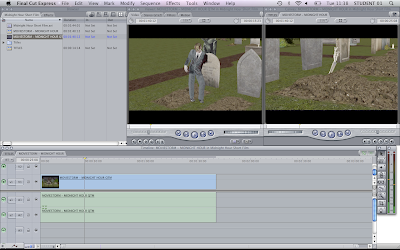
In session 21+22 I made a new sequence and named it "Master" this is where the movie will be put together I then dragged the title, midnight hour and credits together in order in the master sequence. We had a group meeting and decided that we needed more sound effects in the movie so we went into garageband and chose the sound effects that we wanted and we put it in the right place where we wanted the sounds to go. We watched our short film over and over again to make sure that we were happy with the result that we had made.

Moviestorm Session 18+19+20

In session 18, 19 and 20 I created started to create the credits I decided to do something different to the credits and to have it linked to our moviestorm short film. I decided that I was going to have a dancing skeleton on the left hand side whilst the credits were going to scroll up on the right hand side. I went into Moviestorm and I created a new project where I designed the room so that the walls, floor and ceilings were black. I imported the moviestorm into Final Cut and then I exported it out again to Quick Time and i then imported it back into Final Cut. I used Final Cut to create the scrolling text using the credits icon, where I could change the font and the font size that I wanted.

Tuesday 5 April 2011

Moviestorm Session 16 + 17

In session 16 + 17 I imported the png files of my title sequence into Final Cut. I then put the shots into order and using the pen tool and the elastic bands I started to put fades into the title sequence. Jack finished the first section of our Midnight Hour short film and we then imported the shots into Final Cut put then together into a film and exported it again into a Quicktime Movie and imported it again into Final Cut. We will do this to every section that Jack has completed.

Friday 1 April 2011

Moviestorm Session 13 + 14 + 15

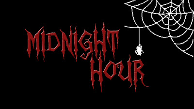
In session 13 + 14 I started working on the title cards. First I went into photoshop and I opened a new project with the width 1280 pixels and the height 720 pixels and the resolution to 300 dpi. Once a blank picture came up I made a new layer and decided to have the background as black. I then I used the font that I downloaded and chosen in session 12 and created a new layer for the words "Midnight" "Hour" I wanted to make the font look more bold and 3D so I went into google and searched how to make 3D text. I came across this website which helped me step by step to creating my 3D text, http://www.depiction.net/tutorials/photoshop/3dtext.php
Once I went through the steps I wanted to stop at step 3 as I like the effect that it gave onto the font. I went through the steps again for the text "Hour".
I wanted to add a image onto the title so I went into google and I searched for "cobwebs" and I then chose a image that I thought would work well in the title.
As the image was not mine I went into photoshop and changed it abit so it would go with my title. Firstly I wanted the image to be white not black as you wouldn't be able to see it in the title card. So I went to Image > Adjustments > Invert. I then wanted to image to be flipped, Image > Rotate Canvas > Flip Canvas Horizontal. I then selected the image and put it into the title card I moved everything around where I thought it should go.
I then clicked on the eye's and just showed the first layer and I went to Save for Web & Devices > PNG 24 > Save.

Thursday 31 March 2011

Moviestorm Session 12

In session 12 I have started to work out how I am going to create the title and the credit cards. I have researched on "Michael Jackson Thriller" and has seen the way they have a title card.

I have searched on the internet but I haven't found the exact font that I need but instead I have found a similar font that would work well with the theme of our short film.
http://www.dafont.com/zombie-holocaust.font
I will be using this font on the title and credit cards.

Moviestorm Session 10+11

In this session I had worked on the treatment because we had a group meeting and thought we had to change the roles that we were in the group as we were thinking which role that would work for us all.
My role is the Editor and the title and credit designer.
Jack's role is Camera Operator and Director.
Lewis' role is the Sound Designer.
Also in this session I had started on my "compare and analyse two moving image products".

Wednesday 30 March 2011

Moviestorm Session 8+9

I was absent in both these sessions as I wasn't feeling very well. My group had drawn up the storyboard and have completed it.

Moviestorm Session 6+7

In session 6+7 we started to decide what out 9 key frames would be in our moviestorm project me and Lewis drew the 9 key frames as Jack was absent. We drew them on post it notes so then we could stick them onto the story board sheets.

Moviestorm Session 4+5

In session 4+5 we did a project proposal/treatment where we got given a template to type in a project proposal of our moviestorm project. There are different sections of the project proposal where we decided what our working title will be. Then we would write the project proposal saying what the film is about. I also said what the target audience would be and our roles we each got given in our group. I also mentioned what equipment we would need to create our moviestorm short film.

Tuesday 22 March 2011

Moviestorm Session 2+3

In session 2 my role was the sound editor but I am also the script writer as we have decided that I needed this role so we have the script with our actions of our characters in it. I created a script. We had a team meeting and have decided to call our Moviestorm movie "Midnight Hour" and I went through the story of our movie and wrote it in the script.
In session 3 we started to create our essay "Compare and analyse two moving image products" we got given a grid where we wrote the two different moving image products and wrote different idea's that we then would put onto our essay. We had to write the purpose, target audience, narrative structure, content & elements, production team & resources, strengths & weaknesses & summary.

Friday 18 March 2011

Moviestorm Session 1


In the first session we had, we had our first meeting as a group and have decided what roles that we would be each be doing. I will be the sound editor creative the music and the sound effects. I was going to be the script/dialogue role but we have decided that we will not need this role because we do not have any dialogue in our short film.
Jack will be creating the characters in our film and Lewis will be creative the setting. After having a discussion about what role we are going to be we could start creating out short film.

Thursday 27 January 2011

Final Video Class Feedback


We had a class viewing where we viewed everyone in our class's first stage of the end sequence project. After we have viewed everyone's film we had made comments on the positive sides of the film and what needs improving. After we had all watched our film "Group 4 End sequence" our fellow classmates had made comments, these are the comments that we recieved.

The positive comments we recieved were:

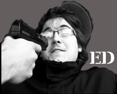
When Ed got shot the camera was a point of view shot and the camera had lifted up when Lewis had shot Ed so it looked like the camera was on Lewis' arm.

We used two different locations that weren't at Long Road where Lewis had come out of the "City House" and had then entered the train station which made the film look good as it was on the real world and was in the different locations.

When Lewis was cutting his hair and washed his face it looked really like he actually changed his identity because in the next scene Lewis' hair has gotten shorter and it had looked like he has changed.

The prop that we had made worked really well as when there was close ups of the file the viewer understood what the prop was and how it worked well in the film if they didn't read the text that was on the file. It made the viewer understand what he was trying to escape in the film.

The breathing on the black screen looked good as it gave the viewer a sence of what is happening fist.

The improvements that we got given were:

The music that played towards the end when Lewis was escaping it came in too sharp instead of softly blending into the film.

Instead of having the office scene it would of looked better if we had a different location, that it isn't at Long Road.

There isn't any evidence of Ed dying there is a gun shot but there isn't any blood, it would of looked better if there was a blood stain so it would looked more real.

In the beginning where the dialogue was it would of been better if Ed was more serious in the film because it looked like he was laughing a bit and said the dialogue quite lightly.

End Credits


Today we started to make our end credit to our end sequence. First we made a new sequence on our final cut end sequence project, and re-named the sequence Credits. You then double click on the credits sequence icon and then it would automatically be on the third tab of the project.
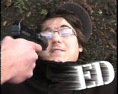
I then chose shot where it would show the character in my end sequence film and then went to File > Export > Using Quicktime Conversion and then clicked on the drop down menu of Quicktime Movie and clicked Still Image I then went to Options and made sure that it was a png as this gives a clear still.
I started editing on photoshop and opened the image on photoshop.
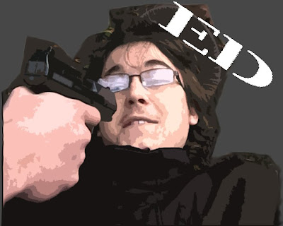
The first image I left the back ground and I went to Filter > Stylize > Wind which gave the image a swept effect. I then added white text in the font "Ver Army" I wanted the same effect so I did the wind effect again but did it another 3 times so it looks more wind swept.

Tuesday 25 January 2011

Session 17 & 18

In Session 17 & 18 we had started to edit the main film onto the main editing computer. To change the visual side of editing, I used the razor tool to shorten the shots so it would increase the pace of the film so it would have a continuity flow to it. I also edited the audio where I used a L-shape edit. Towards the end of the sequence Lewis had found something on Garage Band and we used it in our own film. He has chosen this as it goes well with the genre of the film.
When we watched the film over again we noticed that the effect of the film wasn't very bright and we wanted to to have a bit of colour on it. I went to Effects > Video Filters > Image Control > HSV Adjust, where I then went to the filters on the video bar and I had changed the Saturation, Value and Mix.

Session 16

We had made a prop ready to re-film the office scene as it didn't work in the previous shots because when we had filmed it and it was just a normal plain folder the viewer didn't understand what the folder was about. So we made the prop so it looked more like a top secret file and we had re-filmed the office scene. We used the equipment booking form to book out the equipment we needed, we needed the video camera, tripod and stills camera. The props that we needed were the top secret file and the two bags.
We had changed the shots that we were going to film and included some close ups of the folder into the film so we needed to change the storyboard.
We had a more improved folder prop and we have changed the shots of the office scene as we wanted a close up of the folder so the audience would know more about the film as the folder was a very important part of the film. I think the folder have really worked well in this scene as it shows a important part and because of the folder we understood the film more.

Monday 24 January 2011

Session 15

In session 15 Lewis was a extra in Ed and Ashleigh's film so he was filming with them. I had updated the blogs and had uploaded the pictures from the stills camera to Flickr. There was footage of filming that we had done in previous sessions that needed to be uploaded onto the main computer. So I uploaded the film onto my laptop and had done the same thing as I had done when I had uploaded the other films. I had went through every shot that we had filmed and had write what was good about the shots and what was bad about the shots.

Session 14

In session 14 I had got ready for filming for the office scene where we had to re-shoot with the new prop. I had been catching up on doing the blog posts of each session. I had gone through the film on the main computer and went through what had needed to improve in the film. So we did a rough edit on the film.

Sunday 23 January 2011

Session 13

In Session 13 we have designed the prop of the folder in the office scene. I have used Photoshop to make the prop and have used a template on Google and a top secret image. We then took a picture of Lewis on Photobooth so it looked like it was a identity picture of him as he was on file. Once I have designed the folder I printed the pictures and stuck the pictures on the folder. I then put scrapped paper into the folder so it looked like there was more in the file.

Session 11 & Session 12

In session 11 and 12 we had to re-shoot the train station scene again as the first time we had shot it, you couldn't understand the location where Lewis was. To show that we were at the station we filmed in the middle of the roundabout near the Train station so we could include the sign where it says "Cambridge Train Station". We did a establishing shot of Lewis walking into the Train Station so it looked like he was escaping from murder.


When we finished filming at the train station me and Lewis decided to do another scene in the disabled toilet because when Lewis had come into lesson he had, had a haircut and has changed into new clothes so we decided we would do a few shots of where he changed his identity, this would work well with the end sequence because our story line at the end of the film is where Lewis is trying to escape, so changing his identity would work as he would be escaping like a changed man.
We chose a location with a mirror in it so we could show the viewers of him, himself cutting his hair. We filled our a health and safety sheet about the risks and hazards are when we are in the toilets. The risks are hygiene we can minimise these risks by washing hands after filming. Another hazard is that we are blocking facility from the public as it is a public toilet to minimise this we made sure we knew where other available toilets were and that we would be able to tell the public where else they could go.

Session 10

In session 10 we have planned to re-shoot the train station shot again, but Lewis was not here in the lesson so we couldn't film. Instead I started to edit the film on Final Cut and started to cut out the clapperboards and to cut the shots that were too long and put them more in order and sorted them out more.
I went through the film and then wrote down a list of "things to do" so when we were going to edit we knew a rough idea on what needs fixing first.

Session 9

In session 9 we have continued from session 8 and after we have re-named the shots and have exported them we have them moved the shots onto the main editing computer and we have them imported them onto Final Cut Express. Once we have imported them we looked back at the sheet where we wrote what was good and bad about the shots that we have filmed and we have put the shots in order on Final Cut and we then played the footage without cutting anything so we know a rough order of our film.

Session 8

In session 8 we uploaded all the footage that we had filmed onto our laptops and we have to change each shot into a Quicktime Movie, when we had went through every shot we had to write down each shot number and to say what was good and bad about the shot so when it had come to putting the shots onto the main editing computer we would know which shot to put together straight away, this will be less time consuming. Me and Lewis went through every shot and we decided that some shots would of needed more work on it and that we may have to re-film some shoots.

Session 7

In session 7 we have decided that we were going to film again and to do the office scene, as we weren't able to film at my friends house and it would of been more convenient to film in the office. The equipment that we have used is the video camera, tripod, stills camera. The props we have used in this scene is the two bags, folder. After filming we have decided that the folder didn't really work in the filming as the audience wouldn't of known what the prop was so we have decided that we were going to film in a different session. We had a meeting and we then worked out how we were going to make the folder more into the film so the audience knew what it was.

Session 6

In session 6 we have started to film the scene where the victim (Ed) get shot and Lewis is the killer. We have chosen to film this scene in the Long Road car park, near the recycling bins as if we have shot the shoots from there you would not have noticed that it was at Long Road because most of the shots are close ups. We have asked Ed from another filming group if he would be able to star in our film because there was only two people in our group and not enough actors.
We have booked out the video camera, tripod, professional stills camera, dolly. The props that we used in this shoot was the two bags, gun. During when we were filming we have decided not to use the dolly as the concrete that we were on was very bumpy and it would of made the camera shake, so we have chosen to lift the camera up where Ed was lying on the floor after being shot.

Wednesday 19 January 2011

Session 5

In session 5 we had planned to film at a friends house to do the home scene, when Lewis gets the folder out in the end my friend was busy and we weren't able to film at her house. Me and Lewis had a meeting and we then decided that we should choose a different location that would be more convenient to film so we had changed the location to the office. We had filled in a equipment booking sheet, ready for tomorrow's filming in the morning, and we have discussed what we were going to film and we had re-drew a storyboard of the office scene.

Session 4


In session 4 we got given a health and safety risk assessment sheet where you would fill in the possible risks and hazards that will happen when you are at this location. The sheet would say the date activity and location. For every location we would fill in the table where the possible risks and hazards and how will you minimise these risks. We have filled in the sheets with the locations train stations, disabled toilet, office.

Monday 17 January 2011

Session 3

As we weren't able to film in session 2 because of a delay, we have chosen to film in session 3. We couldn't film on a bus for health and safety reasons and the bus wouldn't of stopped for us everytime we have tried to film the shots on the bus. We had another meeting and me and my team member have discussed that we would film at the train station in Cambridge and we would show that we were at the train station, so it shows that the killer is escaping.
The equipment that we have booked out is the video camera, tripod, stills camera. We have chosen that we would not use the dolly in this filming session, for health and safety reasons that we are in a public place and that there are other members of the public that would need to walk to places.

Session 2

In session 2 we have planned to film in lesson 1 but there was a problem as my other team member has missed the bus so we have delayed the filming to lesson 2.
In this session I have had a meeting and thought of when to film in the next session and I have booked out the equipment using the equipment booking form.
I have sorted out the booklet that we will be taking to our location and to check if we have the clapper boards ready so we would be more organised when we were editing and that we would know which shot number we would be filming.

Friday 14 January 2011

Session 1

In our first session we got given a A3 sheet which was a schedule of 2 weeks, this is where we filled in what we would be doing daily in each session, whether it was to film or to edit.

I have wrote the first ideas in black pen on what we are doing on the first week each day. Everyday had changed towards the end as there was some change of locations and that we couldn't go to that location and also that my other members of team was not there when we was meant to be filming. So we had to change the time we were filming.
This schedule shows what we are going to do everyday and it would help us so we were more organised and ready to film.

We filled in our first equipment booking form which we filled in so we can book out the equipment we need when we are wanting to film.

On the equipment booking form, we have to fill in when we are going to pick up the equipment and when we are going to return the equipment. There then is a list of equipment that is available, we put a tick next to the equipment we need when we are filming. Steve then checks the equipment we have booked out from checking the battery is charged and the shoe on the tripod to seeing if the stills camera is charged and there is a USB lead.

In most sessions we would have a team meeting and we would be given a sheet on what we have talked about in that meeting.

We have to write what meeting we were in and the date and time, who was present at the meeting and what has been talking about. In the first meeting we have decided the roles what me and my team were playing. I was the Director and the camera person.
We also talked about the different locations that we were going to film and what props and equipment that we will be needing in that location.

Thursday 6 January 2011

Action-Thriller Poster Questionnaire Results

I did a questionnaire about my action-thriller posters, and I had got my fellow classmates to fill in the questionnaire's look at the 3 draft posters that I had done. I had gotten quite similar results on the questionnaires.

The age range of my classmates where all 16 year's old, so we are all the same age so we might of liked similar things.
I then asked what gender the people were in my class and I have 7 boys in my class and 1 girl, this makes a difference as the boys would of liked different things to the girl.
I asked them what was the last film that people had watched in the cinema, the results were mostly different and I had only 2 people that had gone to see the same film lately and that was Harry Potter. The rest were different as there is loads of different films out there.
I asked what genre was the film that they last saw in the cinema, and the result was that Action was the film that people had gone to see, this shows that they prefer action films, this is a good thing and it means that people will see my film as the genre of my film is action-thriller.

People thought that Poster 1 would be more effective for my film, I also think this because I like the way the shadow is and it shows the genre of the film, that is quite dark and gloomy. I received quite a few positive comments about why they prefered poster 1 most comments were that the colour had worked well and weren't too packed in the poster and that it was more clearer than the other posters, also that it shows that it is quite scary and shows the genre clearly.

People thought that Poster 2 was least effective because the image didn't show what the film was about and that it weren't clear enough of what was happening.
I asked a question that shows if there was anything to improve, some people said that it was fine but then some said it lacked information on the film.

The next question was if I needed to add more colour to the posters and 88% of the people said that I didn't need to add anymore colours too it but reduce the blood abit.
The final question was which poster was easiest to read Poster 1 is more easier to read because it was clear and more suited the film.

Wednesday 5 January 2011

Contact Sheet - Saatchi Gallery


Saatchi Gallery is in the Duke of York HQ, King's Road, Chelsea, London, SW3 4SQ, U.K. It is for contemporary art and was opened by Charles Saatchi in 1985. The reason why Charles Saatchi opened the Saatchi Gallery was because "I like to show off art I like." In 2010 it has been announced that the Saatchi gallery will be given to the British Public which becomes the Museum of Contemporary Art for London.

The exhibition that we went to was Newspeak - British Art Now Part II. We had taken photo's of the art around the gallery and chose 12 art works that we liked the most and we put them on the individual sqaures. I have used one of the paintings on the background as I also like the painting.

Wednesday 15 December 2010

3 Draft Posters


Poster 1:
In this poster I was trying to achieve a scary atmosphere that includes the bricks at the backgrounds but also a shadow against the wall from the main character. I have only showed half of the main character so it emphasizes the shadow. I wanted to show the main character of the film because main film stars make's films so then people are more encouraged to see it. The actor is holding a gun to his hand so this shows that it is a action thriller film, which includes voilence and death. The title of this film has a red font that looks like blood that drips to show that it includes blood which makes the genre of the film thriller.

Poster 2:
This poster is a teaser poster to introduce the main character in the film, this is showing the victim showing emotion when he is getting shot, I have included blood at the side of his head to show that there is a shooting and that this shows the genre in the film. The film title is in a graffiti type font to show the atmosphere of there it is set.

Poster 3:
In this poster I have included a release date this is to show when the film is out for the audience to go see it. I have not included any characters in this poster but have included the objects that are being used in this film, I have included guns and drugs to show what the film is about from a audience view it is a negative film especially as the objects are in a pool of blood. The film title I have left it as a simple black font because I wanted the blood to stand out and be the main focus when the audience see's it.

Monday 13 December 2010

Harry Brown


People
In this film poster of Harry Brown, it shows the main character “Harry Brown” played by Michael Caine is on the right hand side of the poster quite large, he has carrying a big bag and gun this is to show that the film is violent. On the left hand side there is a gang holding guns aswell and the main gang leader in the front. This is showing that Harry Brown has been involved with a gang and that they are looking for trouble.

Design
The design of this film is giving out a grim feeling because of the weapons involved that will show that it is a violent film. The colour of the actors are in black and white this is showing boldness and a dark mood. There is a target in the middle of the poster to show that there might be a sort of assassination in the film.

Colour
There is only colour on the target to make the title stand out and that they have a used a blue and red which are primary colours and they stand out against the white. The characters are all black and white to show that is it a grim film and quite dark. They also still stand out when they are against a plain white colour background.

Title
The title is easy to read, it is in a white colour and in a simple font, this is against the target and is slightly slanted like you were looking at the target slanted.

Other Information

Above the main title it says the main character's name that played Harry Brown “Michael Caine” this is showing that the film is mainly about him and that whoever enjoys his films.
There is a tag line at the bottom of the first word of the main title “One man will take a stand” This shows adrenaline in the film and that there is violence and death in the film.
At the bottom the poster is shows the realised date of the film in bold and clear to read so that the audience will know when to see the film.

Friday 10 December 2010

Adulthood


People
In this poster of "Adulthood" there are the 8 main actors in the film, they are in different certain positions to show fear as you can tell by there facial expressions. You can tell that they are associated with gangs, as they are wearing hoodie's and trackies and they way that they are standing shows that they are together in a gang, you can see the main character is standing up near the front to show he may be the leader of the gang and that the rest are sitting on the floor that are in the front to show they are part of the gang. They are placed together as in one big group, to show what the film is about gangs. At the bottom of the poster there is a baseball bat, this shows that there is violence in this film as it is on the floor in front of the gang.

Design
The design to this film has a grim feeling to it as it is trying to evoke fear as there are weapons on the floor to show violence and that the way the people are put close together to show more fear in the design as they are together in a group as one gang.

Colour
The colour scheme on this film poster is dark warm colours, the sky is a warm orange colour to show sunset, the buildings in the background are silhouetted in a black colour to show boldness. The clothing colour that the actors are wearing are quite dark black and grey colours whereas the girls that are in the film are wearing quite bright colours this is to show what sort of clothing that they wear.

Title
The title of the film is in a simple font where it is easy to read and and it is center aligned at the bottom of the poster. It is the first thing you will read as it is quite large and bright with the white against the ground dark colour.

Other Information
There is a tag line on top of the main title "After kidulthood comes..." this is good for the audience and it is a second film from when people enjoyed watching kidulthood. At the bottom of the main title it says "A Noel Clarke film" this is telling the audience who directed the film, as the audience may enjoy the other films that the directer has directed.


Snatch


People
In this poster Snatch it has the main characters in the film, if people have a favourite actor/acctress that they like they would want to see a film with there favourite actor/actress. If the actor/actress is a big film star, people would be more likely to see the big film stars. Brad Pitt is there because he is the biggest major star and is larger than the other actors, the other actors are only just introduced. You get the two main characters (Turkish and Tommy) in the middle so it shows like a tunnel into the characters when you look at the characters standing in a certain way to show what the film is about, they are wearing big long coats with gold jewlerry and crosses.

Design
The design to this film shows a comedy mood to it, where there are the different gangs and there will be a leader that will lead the gang, the way the actors are standing would show a comedy side to it, for example Tommy is putting a gun to his trousers and the way he it is doing it sneakly so that Turkish wouldn't see.

Colour
The colour scheme of the poster is just a warm red colour, all the characters are in just one colour, these colours have been chosen to symbolise blood and violence in the movie when there are gangs there will be violence.

Title
The title of this film is "Snatch" in the film poster is it easy to read as it is quite bold with a simple font. They have used the colour white so it would stand out against the warm red colour of the actors. Snatch is a simple and direct one worded title, it is in the centre where the characters all sit above the title.

Other Information
There is a tag line "stealin' stones and breakin' bones" underneath the main title, it is in the same font as the title, which then makes the audienece read the tag line after they have read the title.
On the top of the poster it tells you the main characters in the film, this will actract the audience if they have a certain actor that they like to see.
In a small font on top of the title it says "A Guy Ritchie Film" this shows who directed the film, so that audience may want to see it as they enjoy Guy Ritchie's work.


Tuesday 7 December 2010

Story Board


In the opening scene you have an extreme close up of a gun pointing at a man and then it would go to a close up and that will show the victims fear. They victim then gets shot and we have used a point of view shot to show the killers reaction when he is shooting the victim.
After the shot it will show the victim on the floor laying down with his bag next to him. The killer will then see the bag and starts to pour the objects on the floor. There will be a close up of the objects all together on the floor.


On the second page of the story boards the killer panics and starts to put the objects back into the bag he will then look around and picks up the victim and tries to look around where to put him he then finds the nearest large bin and he puts the victim into the bin. There is then a establishing shot where the kills is then walking away. The victim gets to his house and walks into through the door. He is then in his room and he takes the stuff out of his own bag and he puts the victims bag into his bag.


On the third page of the story board it starts with a establishing shot where he then walks out of his house and then goes onto the public bus. Then there is a close up of his face where he is on the bus and on the phone. He then gets off the bus and goes into a alleyway where he is meant to meet someone. There is then a close up of them both giving the bag to the man and trading money.

Wednesday 1 December 2010

Action-Thriller Moodboard


I was set a task to create a moodboard in Photoshop to give us idea's about the short film that I am going to create.
I have included the main aspects that will be in a Action Thriller film for example, guns, blood, drugs and gangs.
I have gotten picture's from google images and some from flickr. I got taught about the creative commons which is about the copyright policy when we are using other people's images.

Tuesday 16 November 2010

Sabotage


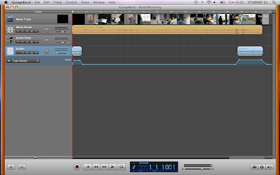
This is the garage band project, where we added additional sound to our film.

This is the final film of "Sabotage"

Wednesday 10 November 2010

Garage Band


We used the program Garage band, I tried to achieve a dance beat track, I had used a hiphop beat with a RnB beat as the background sound but then used the dance bass synth with the dance pad, I used the tambourine so join with the background sound, but I had cut the tambourine and left a hole but then joined it back in again after, I then left a fade towards the end by changing the sound of the volume of the synths.

We uploaded the MP3 on divshare, to get a MP3 track, exported my work to disk and I ticked the compress box using MP3 encoder and changed the audio setting to higher quality.